ShopDreamUp AI ArtDreamUp
Deviation Actions


Suggested Deviants


Suggested Collections


You Might Like…


Description
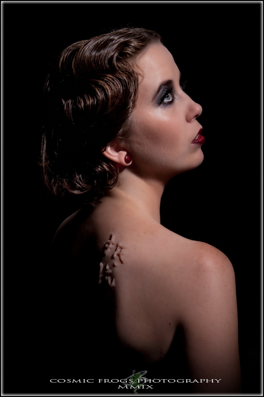
^cosfrog was kind enough to indulge me during his Open House.
Let me explain.... ^quietchildae and I have been musing over a scarification makeup project for a while. I have some remarkable products that we both thought would do the trick.
Come to happen that she came down for a visit this weekend and we carpooled with friends to the ^cosfrog Open House.
I had called ahead asking.... so, you wanna do a scarification set? He said sure, but didn't quittttte know what we were up to.
If you've met ^quietchildae, you know that she can aptly be described as a spitfire. She chose the kanji "resistance" for her heal scarification effect.
The kanji was hand sculpted on the spot.
To offset the kanji and it's texture, we went for a nod to the vintage with a sort of finger wave in the hair and classic makeup colors.
I love how her red ear plug serves as a perfect bridge between the eras.
Image size
533x800px 122.41 KB
Make
Canon
Model
Canon EOS-1D Mark III
Shutter Speed
1/200 second
Aperture
F/18.0
Focal Length
51 mm
ISO Speed
100
Date Taken
Aug 22, 2009, 6:54:34 PM
© 2009 - 2024 Battledress
Comments25
Join the community to add your comment. Already a deviant? Log In
This is a great piece, but I feel the lighting is off.
When looking at the shot, it does have a 'vintage' feel, but again that is off just slightly. I can't quite nail what feel off... but it may be the lighting on the hair. It is lost in the background and the makeup doesn't quite make up for the vintage look. Perhaps if the model was wearing a backless dress (so the scar can be seen) that showed the more the colors of the era. Maybe a different hairdo would have worked (more the forhead ringlets?)
The problem with the lighting I have is the scar seems to fad a bit 'too' much on the sholder. Again it's a very small gripe. The left of the symbols is very solid, and has a nice defined shadow. The right of the symbols gives it a 'mushy' feeling.
The left sholder is also driving me mad. It ether needs more light to define it more or less to hide it compeltely. As I stare at the image, my eyes are inching towards the left sholder. Again very small issue.
Overall I like this picture. When considered againt the question "Would I hang this on my wall" the answer is "yes".